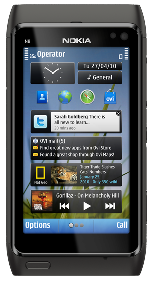
For the last two weeks, my HTC Desire has been off for repair, and Nokia very kindly sent me an N8 to try for two weeks, so I wasn’t stuck with the terrible handset T-Mobile gave me. The only condition…. this review.
So here it is the highs and lows of my first Nokia handset, from a user experience designer’s perspective.
I was impressed at first, the N8 offers some haptic feedback, which I think is very valuable when dealing with touchscreen interfaces, but in my opinion it’s too indiscriminate, as you get feedback for any action you perform, including scrolling. However the button feedback is very subtle and effective, with a down and up feedback, much better than other touch screen devices I’ve used.
[more]
The handset itself ok, about the same size and weight as my HTC Desire, complete with audio jack, USB, camera and MicroSD expansion in a sealed unit like an iPhone. In addition it has a HDMI output, which makes more sense when you look at the camera on this handset.
The camera is pretty outstanding, it’s 12 megapixels and has a Carl Zeiss lense and includes a flash. The handset has a dedicated photo button, making it very easy to switch into camera mode. Although the case doesn’t offer a way to protect the lense cover, which is a shame, but would add bulk. The camera is so good that if that features heavily into your phone choice you should definitely consider this handset.
The problem for me came with the operating system, it does do a bunch of cool stuff, but Symbian is still feature rich at the cost of usability. Holding down call, allows you to open apps by voice, but you have to know what to call it, e.g. Internet got me nowhere, while it recognised Contacts and Calendar.
The biggest failing for me was the difficulty with which to get to applications. The desktop space, has multiple screens and is easy to customise, but you can only add widgets, not shortcuts to applications; an option called “shortcuts” just offering four pre-populated shortcuts and if these could be customised I couldn’t work out how. Instead accessing the apps requires I press the home button and navigate through a screen that looks like a slightly improved version of the old ‘mystery meat’ Symbian menu, to an application menu, where all the good stuff sits. It’s only saving grace is that it highlights which applications are open with a little green ‘o’ next to the icon in this menu, and that it is easier to close applications than in either IOS or Android.
It seems fair at this point to talk about the application ecosystem, Nokia has its own ecosystem called Ovi, in the same way Android has Google and the iPhone has iTunes and Mobile Me. You can buy apps and backup your contacts in the same way you can on any smartphone . The problem here is that with any smartphone the apps have a really important part to play. The usual suspects do make an appearance, so you can still play Angry Birds on your N8, but there will be less applications available for general consumption. The Ovi store works smoothly and is not unlike using Android’s marketplace, so it works well, but doesn’t offer anything new. A shame as I think the app stores are the areas that now really need reconsidering in terms of usability.
I did get frustrated when I couldn’t find the handset MAC address, so was unable to add it to my wireless network. Information like this can be well hidden, but it should be available somewhere, after a google I found out you need to put a code into the call screen, which for me is beyond obtuse.
The compact charger is a delight, much lighter and smaller than most, although why it isn’t a USB charger I don’t know.
Overall I did struggle with this handset a bit, but this may be largely because I’m already heavily invested into the Google ecosystem, so once I sync my phone with my Google account everything else comes to life. But I have no investment in Ovi and despite creating an account for this review, it’s unlikely I would ever use it in the same way – seamlessly across multiple platforms. I think that the hardware is pretty good, the camera especially is outstanding, but it needs an operating system that has been built from the ground up as a smartphone OS and Symbian still fails on that front.
Thanks to the great guys at WOMWorld Nokia for the loan of the phone, and credit should be given to Nokia for supporting a venture that engages with social media in a smart way. I expect this will be the first and last review I ever get to do thanks to Twitter, but it has been a great experience.
Useful review Elsa. Fortunately the Symbian shortfalls will be addressed when Nokia move to Windows Phone later in the year.
I haven’t had a hands on Windows Mobile 7 yet. Much improved from 6.5 I’ve heard, which was on my last handset. But likely to be a good improvement on Symbian, which seems to be fighting with itself, like much software with a legacy issue.
“an option called “shortcuts” just offering four pre-populated shortcuts and if these could be customised I couldn’t work out how”.
You can customise these shortcuts: Just tap and hold to screen, then tap those shortcuts and then go to settings. There you can choose any program or bookmark you want.
Comments are closed.