User Interfaces in Games
Games UI Series
For some time I have written about both my professional and social interests on this blog; covering user experience and gaming, but I want to combine them and look at user interface design in games. I think this is an oft-neglected part of games, especially with the usual budget and time constraints, however as with any software design the usability of the user interface can have a profound effect on the user’s experience.

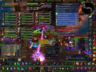
An advanced user experience on World of Warcraft
Usability in games is not restricted to on screen interactions, there is a such diversity of ways to interact with your gaming platform of choice; be it joypad, keyboard, touch screen, or no controller at all. This makes the platform and method of interaction a key part of the user experience in games, as such I will explore the strengths and weaknesses of these human-computer interfaces.
Some games designers and developers think that creating games is completely different to creating other software, because they are creating entertainment rather than tools. However recently as we have seen an increasing overlap between games and applications e.g. Epic Win we can see that these lines are far more blurred than previously considered. Software development has only recently realised the commercial value of user experience, but games developers often consider themselves the audience as well as the creators, failing to realise that their familiarity with their game hampers their ability to see their product impartially; perhaps more frustrated by the focus groups that require them to “dumb down” games than they are in the issues that may cause that confusion in the first place. While games do need to offer challenges in order to evoke a sense of achievement, these challenges should be designed and deliberate and not a hurdle of a poorly designed interface.
I was delighted to see that Edge has added to its staff Graham McAllister; the CEO of Vertical Slice, the UK’s first usability testing company to focus solely on games. This recognition of the need for usability in an industry leading publication can only help raise the profile of the value of understanding your users.
I’m hoping to write a series of game reviews, which look specifically at the UI and give a heuristic review on their strengths and weaknesses as well as offering possible alternative solutions where appropriate.Read More »User Interfaces in Games